
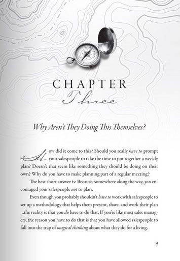
Book interior design is something most authors overlook, but readers feel it immediately.
Most authors spend months, sometimes years, writing their book. Then they spend weeks agonizing over the cover. Interior typography? That often gets handled in an afternoon with whatever default settings the word processor provides.
This is a mistake that readers feel, even when they can’t articulate why.
Book interior design starts with reading experience
Typography in a book interior isn’t just about choosing a nice font. It’s about managing a physical experience. When a page is set correctly, reading feels effortless. The eye moves across lines without strain, paragraphs feel proportioned, and the reader sinks into the text. When a page is set poorly, reading feels like work, even when the prose itself is brilliant.
The difference often comes down to details that seem minor: line length, leading (the space between lines), tracking (the space between letters), and the relationship between body text size and the margins surrounding it.
The fundamentals of interior type design
Line length should be comfortable for the eye to travel. The classic guideline is 45, 75 characters per line, enough to feel substantial, not so much that the eye loses its place when returning to the left margin. This is largely controlled by the combination of page size, margin width, and font size, and getting it right requires balancing all three.
Leading in print books typically runs 120, 145% of the type size. Body text at 11pt often works best with 14, 15pt leading. Too tight and the lines feel cramped; too generous and the text loses cohesion.
Widows and orphans, single words or lines left at the top or bottom of a page, are a hallmark of unprofessional formatting. Professional interior designers spend time adjusting copy fit to eliminate them throughout the manuscript.
Justified vs. ragged right text is a choice that affects the texture of the page. Justified text is traditional in most genres and gives pages a formal, settled feel. It requires careful hyphenation settings to avoid rivers of white space running through paragraphs. Ragged right feels more contemporary and is common in nonfiction and children’s books.
Front matter and chapter architecture
The interior of a book is more than just the body text. Drop caps, chapter headings, running headers and footers, page numbers, section breaks, front matter (title page, copyright, dedication, table of contents) and back matter, all of these need to be designed with consistency and intention.
A beautiful chapter opening page sets the mood for everything that follows. A well-designed table of contents communicates the book’s structure at a glance and builds reader confidence before they’ve read a word.
Print vs. digital considerations
If your book will be distributed in both print and ebook formats, the book interior design needs to account for both. Print interiors are designed in fixed-page formats like InDesign or PDF. Ebook interiors use reflowable formats where the reader controls font size, and your design work is largely about creating a clean, structured HTML foundation.
These are genuinely different skills, and they serve genuinely different reading experiences. A professional book designer will work with you on both.
The signal professional typography sends
Readers, reviewers, librarians, and booksellers evaluate professionalism instantly. A book with clean, well-considered interior typography signals that the author and publisher take quality seriously. A book interior design with cramped text, inconsistent spacing, and amateur chapter headers signals the opposite, regardless of what’s actually on the page.
If you’re publishing a book and want readers to take it seriously, book interior design deserves the same investment as the cover. Contact Dino Marino Design to discuss your book’s interior formatting.